
Apple‘s iCloud.com is typically the place I go when I need to download a bunch of photos or other files from my iCloud account, but it’s not something I’d use on a daily basis.
With a new redesign, launched on Wednesday and spotted by MacRumors, iCloud.com has become easier to use, and it’s now a pretty decent overview of all the stuff you keep in Apple’s cloud.
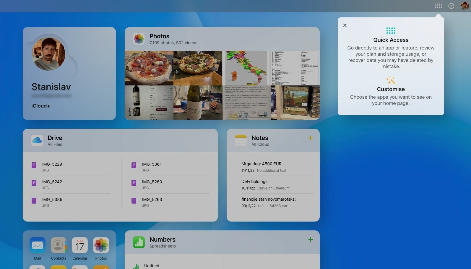
The new iCloud.com now resembles an iPad’s interface, with apps such as Photos, Mail, Calendar, and Drive organized into widgets of various sizes. You can move the widgets around, or turn them on and off by clicking on the “Customise Home Page” button at the bottom of the display. There, you’ll find a quick overview of the status of your iCloud account, including the cost of your plan and the amount of storage you have left. Pity you can’t change the wallpaper, though.
Some of these apps are redundant; for example, Find My comes pre-installed on a Mac, and a notice on top of the display actually tells you this as you try to open the app on iCloud.com. Most of the apps haven’t changed since the previous iteration of iCloud.com, and still feel like stripped-down versions of iPadOS or macOS apps.
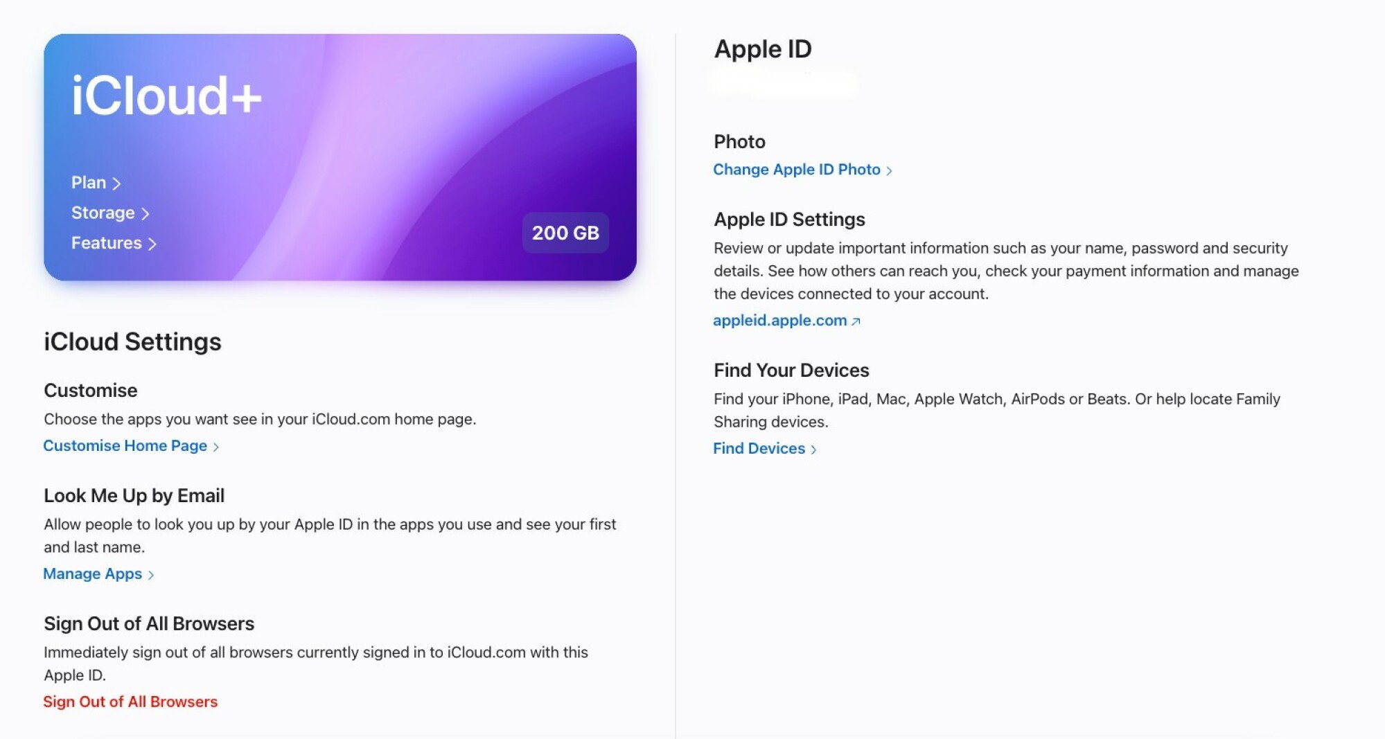
Apple gave perhaps the nicest update to the iCloud “app” itself, which basically leads you to a settings page. It now gives a neatly laid out, clean overview of your iCloud plan, a detailed breakdown of how you use the cloud storage, data recovery options, and iCloud features that you have active. All of this was accessible on the old site as well, it’s just nicer to look at now.
Credit: Stan Schroeder/Mashable/Apple
As nice as the redesign is, I don’t expect many users to suddenly start flocking to iCloud.com and using it every day, but as a one-stop-shop for everything you have on iCloud, however, it’s now a sensible option.