From Wikipedia, the free encyclopedia
 Size of this preview: 640 × 451 pixels
 Full resolution (950 × 670 pixels, file size: 226 KB, MIME type: image/png)
 |
This is a file from the Wikimedia Commons. The description on its description page there is shown below.Commons is a freely licensed media file repository. You can help.
|
It is said that this was the worst war in history.
Summary
 |
This graph image should be recreated using vector graphics as an SVG file. This has several advantages; see Commons:Media for cleanup for more information. If an SVG form of this image is already available, please upload it. After uploading an SVG, replace this template with {{ vector version available|new image name.svg}}. |
العربية | Български | Català | Česky | Dansk | Deutsch | English | Esperanto | Español | Français | Galego | 한국어 | Italiano | Magyar | Lietuvių | Nederlands | 日本語 | Polski | Português | Română | Русский | Suomi | Svenska | Türkçe | Українська | 中文(繁體) | 中文(简体) | +/- |
| Description |
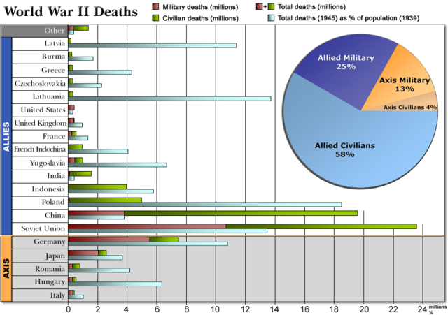
Chart showing military, civilian and total deaths for the Allied and the Axis Powers during World War II, 1939-1945 .
The y-axis shows both deaths in millions and percentage of population.
Legend:
Red bars: Military deaths in millions.
Green bars: Civilian deaths in millions.
Stacked bar (Red+Green): Total deaths in millions.
Light blue bars: Total deaths (1945) as percentage (%) of population (1939).
Axis countries are at the bottom, headed by an orange bar and with a grey background (Germany, Japan, Romania, Hungary & Italy).
Allied countries are at the top, headed by a blue bar.
Other countries' statistics are collected into the topmost grey item "Other".
The inserted top right piechart shows the total percentage of military and civilian deaths for the Allied and the Axis Powers. The original piechart version can be found here: Image:WorldWarII-DeathsByAlliance-Piechart.png. |
| Source |
Self-made, using figures from World War II casualties |
| Date |
October 21, 2007 |
| Author |
User:Dna-Dennis |
Permission
( Reusing this image) |
Public domain |
| Other versions |
If you have any opinions/suggestions, please contact me here on my talk page.
This chart was inspired by Image:Human losses of world war two by country.png. |
.
Licensing
|
|
I, Dennis Nilsson, the copyright holder of this work, hereby release it into the public domain. This applies worldwide.
In case this is not legally possible:
I grant anyone the right to use this work for any purpose, without any conditions, unless such conditions are required by law.
Afrikaans | Alemannisch | Aragonés | العربية | Asturianu | Български | Català | Cebuano | Česky | Cymraeg | Dansk | Deutsch | Eʋegbe | Ελληνικά | English | Español | Esperanto | Euskara | Estremeñu | فارسی | Français | Galego | 한국어 | हिन्दी | Hrvatski | Ido | Bahasa Indonesia | Íslenska | Italiano | עברית | Kurdî / كوردی | Latina | Lietuvių | Latviešu | Magyar | Македонски | Bahasa Melayu | Nederlands | Norsk (bokmål) | Norsk (nynorsk) | 日本語 | Polski | Português | Ripoarisch | Română | Русский | Shqip | Slovenčina | Slovenščina | Српски / Srpski | Suomi | Svenska | ไทย | Tagalog | Türkçe | Українська | Tiếng Việt | Walon | 中文(简体) | 中文(繁體) | zh-yue-hant | +/- |
File history
Click on a date/time to view the file as it appeared at that time.
|
|
Date/Time |
Dimensions |
User |
Comment |
| current |
12:11, 21 October 2007 |
950×670 (226 KB) |
Dna-webmaster |
|
|
|
11:08, 21 October 2007 |
950×670 (94 KB) |
Dna-webmaster |
|
File links
The following pages on Schools Wikipedia link to this image (list may be incomplete):


