Calligraphy
2008/9 Schools Wikipedia Selection. Related subjects: Art
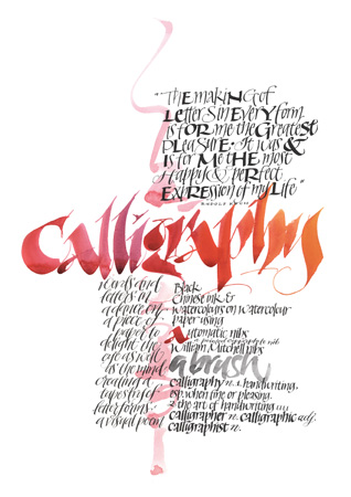
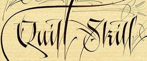
Calligraphy (from Greek κάλλος kallos "beauty" + γραφή graphẽ "writing") is the art of beautiful writing (Mediavilla 1996: 17). A contemporary definition of calligraphic practice is "the art of giving form to signs in an expressive, harmonious and skillful manner" (Mediavilla 1996: 18). The story of writing is one of aesthetic evolution framed within the technical skills, transmission speed(s) and materials limitations of a person, time and place (Diringer 1968: 441). A style of writing is described as a hand or alphabet (Johnston 1909: Plate 6).
Calligraphy ranges from functional hand lettered inscriptions and designs to fine art pieces where the abstract expression of the handwritten mark may or may not supersede the legibility of the letters (Mediavilla 1996). Classical calligraphy differs from typography and non-classical hand-lettering, though a calligrapher may create all of these; characters are historically disciplined yet fluid and spontaneous, improvised at the moment of writing (Pott 2006 & 2005; Zapf 2007 & 2006). So, many calligraphers are as happy with "jazz" as "classical" for musical analogy and represents differing emphasis between artists.
Calligraphy continues to flourish in the forms of wedding and event invitations, font design/ typography, original hand-lettered logo design, commissioned calligraphic art, cut stone inscriptions, memorial documents, props and moving images for film and television, testimonials, maps, and other works involving writing (see for example Letter Arts Review; Propfe 2005; Geddes & Dion 2004).
East Asian calligraphy
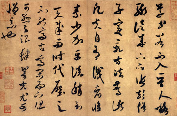
Asian calligraphy typically uses ink brushes to write Chinese characters (called Hanzi in Chinese, Hanja in Korean, Kanji in Japanese, and Hán Tự in Vietnamese). Calligraphy (in Chinese, Shufa 書法, in Korean, Seoye 書藝, in Japanese Shodō 書道, all meaning "the way of writing") is considered an important art in East Asia and the most refined form of East Asian painting.
Calligraphy has also influenced ink and wash painting, which is accomplished using similar tools and techniques. Calligraphy has influenced most major art styles in East Asia, including sumi-e, a style of Chinese, Korean, and Japanese painting based entirely on calligraphy.
| The main categories of Chinese-character calligraphy | ||||
|---|---|---|---|---|
| English name | Hanzi(Pinyin) | Hangul( RR) | Rōmaji | Quốc ngữ |
| Seal script | 篆書(Zhuànshū) | 전서(Jeonseo) | Tensho | Triện thư |
| Clerical script (Official script) | 隸書 (隷書)(Lìshū) |
예서(Yeseo) | Reisho | Lệ thư |
| Regular Script (Block script) | 楷書(Kǎishū) | 해서(Haeseo) | Kaisho | Khải thư |
| Running script (Semi-cursive Script) | 行書(Xíngshū) | 행서(Haengseo) | Gyōsho | Hành thư |
| Grass script (Cursive script) | 草書(Cǎoshū) | 초서(Choseo) | Sōsho | Thảo thư |
Indian calligraphy
Early calligraphy
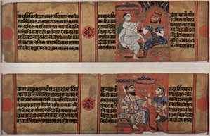
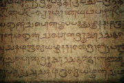
Early Calligraphy in India is found in old Sanskrit works, usually scriptures and epics belonging to the Dharmic religion family. Calligraphy was usually more highly developed in Buddhist and Jaina traditions than in Hindu circles.
Monastic Buddhist communities had members trained in calligraphy having shared responsibility for duplicating sacred scriptures (Renard 1999: 23-4).
Jaina traders incorporated illustrated manuscripts celebrating Jaina saints. These manuscripts were produced using inexpensive material with fine calligraphy (Mitter 2001: 100).
Ashoka the great was the Mauryan emperor who had the edicts of Ashoka incised on rocks and pillars situated in important centers of his empire. He was a patron of calligraphy and painting.
Middle ages
Indian traders, colonists, military adventurers, Buddhist monks and missionaries bought the Indic script to the countries of South East Asia.
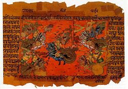
The languages of these regions were influenced by the Indic script; the influence came in the form of the basic internal structure, the arrangement and construction of syllabic units, manner of representation of characters, and the direction of writing (left to right) (Gaur 2000: 98). Fine Sanskrit calligraphy, written on palm leaf manuscripts was transported to various parts of South East Asia, including Bali (Ver Berkmoes ?: 45).
The Persian influence in Indian calligraphy gave rise to a unique and influential blend in Indian calligraphy. Some of the notable achievements of the Mughals were their fine manuscripts; usually autobiographies and chronicles of the noble class, these manuscripts were initially written in flowing Persian language. This style of calligraphy was later exposed to and influenced by the native traditions of India, such as the Indian epics, including the Ramayana and Mahabharata (Bose & Jalal 2003: 36).
Emperor Humayun had bought Persian calligraphers into India; they would later be joined by native Hindu artists of India to further promote this art in the court of emperor Akbar (Bose & Jalal 2003:36).
The Arabic text on the Qutab Minar is in the Kufic style of calligraphy; decorations with flowers, wreaths and baskets show the native influence of Hindu and Jaina traditions (Luthra ?: 63).
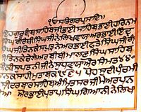
Sikhism played a key role in the history of Indian calligraphy. The holy book of the Sikhs has been traditionally handwritten with illuminated examples. Sikh calligrapher Pratap Singh Giani is known for one of the first definitive translations of Sikh scriptures into English.
The Oxford manuscript of Shikshapatri is an excellent example of Sanskrit calligraphy. The manuscript is preserved in the Bodleian Library (Williams 2004: 61).
Tibetan calligraphy
Calligraphy is central in Tibetan culture. The script is derived from Indic scripts. As in China, the nobles of Tibet, such as the High Lamas and inhabitants of the Potala Palace, were usually capable calligraphers. Tibet has been a centre of Buddhism for several centuries, and that religion places a great deal of significance on written word. This does not provide for a large body of secular pieces, although they do exist (but are usually related in some way to Tibetan Bhuddism). Almost all high religious writing involved calligraphy, including letters sent by His Holiness, the Oracle of the Potala Palace, and other religious, and secular, authority. Calligraphy is particularly evident on their prayer wheels, although this calligraphy was forged rather than scribed, much like Arab and Roman calligraphy is often found on buildings. Although originally done with a brush, Tibetan calligraphers now use chisel tipped pens and markers as well.
Persian calligraphy
Persian calligraphy is the calligraphy of Persian writing system. The history of calligraphy in Persia dates back to the pre-Islam era. In Zoroastrianism beautiful and clear writings were always praised. The main types of Persian calligraphy are: Nasta'liq script, Shekasteh-Nasta'liq script and Naghashi-khat.
Islamic calligraphy
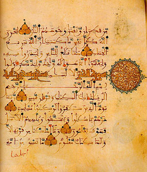
Islamic calligraphy (calligraphy in Arabic is Khatt ul-Yad خط اليد) is an aspect of Islamic art that has evolved alongside the religion of Islam and the Arabic language.
Arabic/Persian calligraphy is associated with geometric Islamic art ( arabesque) on the walls and ceilings of mosques as well as on the page. Contemporary artists in the Islamic world draw on the heritage of calligraphy to use calligraphic inscriptions or abstractions in their work.
Instead of recalling something related to the reality of the spoken word, calligraphy for Muslims is a visible expression of the highest art of all, the art of the spiritual world. Calligraphy has arguably become the most venerated form of Islamic art because it provides a link between the languages of the Muslims with the religion of Islam. The holy book of Islam, al-Qur'an, has played an important role in the development and evolution of the Arabic language, and by extension, calligraphy in the Arabic alphabet. Proverbs and complete passages from the Qur'an are still active sources for Islamic calligraphy.
There was a strong parallel tradition to that of the Islamic, among Aramaic and Hebrew scholars, seen in such works as the Hebrew illuminated bibles of the 9th and 10th centuries.
Islamic Calligraphy was a form of art. Muslims believed that only Allah could create images of people and animals.
Western calligraphy
Western calligraphy is the calligraphy of the Latin writing system, and to a lesser degree the Greek and Cyrillic writing systems (Daniels & Bright 1996; Knight 1996). Early alphabets had evolved by about 3000 BC. From the Etruscan alphabet evolved the Latin alphabet. Capital letters (majuscules) emerged first, followed by the invention of lower case letters (minuscules) in the Carolingian period (Mediavilla 1996). The history of lettering records many excursions into historical obscurity and disuse as well as elaborating the story of what gave rise to contemporary print (Walther & Wolf 2005; Gray 1986).
Long, heavy rolls of papyrus were replaced by the Romans with the first books, initially simply folded pages of parchment made from animal skins. Reed pens were replaced by quill pens (Jackson 1981).
Christian churches promoted the development of writing through the prolific copying of the Bible, particularly the New Testament and other sacred texts (de Hamel 2001a). Two distinct styles of writing known as uncial and half-uncial developed from a variety of Roman bookhands (Knight 1998: 10)."Uncia" is the Latin word for inch (Brown & Lovett 1999: 39). The 7th-9th centuries in northern Europe were the heyday of Celtic illuminated manuscripts, exemplified by the Book of Durrow, Lindisfarne Gospels and the Book of Kells (Trinity College Library Dublin 2006; Walther & Wolf 2005; Brown & Lovett 1999: 40; Backhouse 1981).
Charlemagne's devotion to improved scholarship resulted in the recruiting of "a crowd of scribes", according to Alcuin, the Abbot of York (Jackson 1981: 64). They developed the style known as the Caroline or Carolingian minuscule (minuscule is a synonym for "lower-case"). The first manuscript in this hand was the Godescalc Evangelistary (finished 783) — a Gospel book written by the scribe Godescalc (Walther & Wolf 2005; de Hamel 1994: 46-48). Carolingian remains the one progenitor hand from which modern booktype descends (de Hamel 1994: 46).
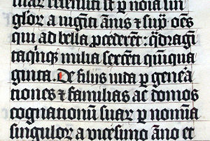
Blackletter (also known as Gothic) and its variation Rotunda, gradually developed from the Carolingian hand during the 12th century. Over the next three centuries, the scribes in northern Europe used an ever more compressed and spiky form of Gothic. Those in Italy and Spain preferred the rounder but still heavy-looking Rotunda. During the 15th century, Italian scribes returned to the Roman and Carolingian models of writing and designed the Italic hand, also called Chancery cursive, and Roman bookhand. These three hands — Gothic, Italic, and Roman bookhand — became the models for printed letters. Johannes Gutenberg used Gothic to print his famous Bible, but the lighter-weight Italic and Roman bookhand have since become the standard.
During the Middle Ages, hundreds of thousands of manuscripts were produced: some illuminated with gold and fine painting, some illustrated with line drawings, and some just textbooks (Kerr 2006; Alexander 2005; de Hamel 2001b & 1992; Wieck 1983).
Resurgence of Western calligraphy
The Gutenberg Bible sparked the synergy of the printing press and movable type for the first time in Mainz Germany in about 1455, but was not the end of handwriting (Zapf 2007; de Hamel 2001a; Gilderdale 1999; Gray 1971). Illuminated manuscripts declined however after printing became ubiquitous (de Hamel 2001a; de Hamel 1986). Conventionally the histories of Copperplate hands have represented such writing to have been with a sharp pointed nib instead of the broad-edged one used in most calligraphic writing. This so called "Copperplate Myth" represents the name to come from the sharp lines of the writing style resembling the etches of engraved copper printing plates (for example Harris 1991: 117). It is unlikely that this picture represents the historical origins of the term accurately, but is rather more reflective of later 19th and 20th century antipecuniary comfort of the Arts and Crafts movement participants (Gilderdale 1999; for example Hewitt 1930). It is most likely that what is today written with pointed steel nibs ("copperplate", Zanerian, Spencerian hands for example) began stylistic life before the 1820's with a broad edged quill and a number of period pen hold, posture and arm position variations to facilitate the fine lines (Gilderdale 2006; Henning 2002; Gilderdale 1999; Bickham 1743). Hence there was likely a gradual change in historic writing practices and a reorientation of the vocation and place of writing rather than the elimination of the art.
At the end of the 19th century, the rise of William Morris and the Arts and Crafts movement's aesthetics and philosophy captured many calligraphers, including Englishmen Edward Johnston and Eric Gill (Cockerell 1945; Morris 1882). Johnston and his students were to redefine, revive and popularise English broad-pen calligraphy. Edward Johnston developed his own broad-edged hand after studying 10th-century manuscripts, such as the Ramsey Psalter, BL, Harley MS 2904, following an introduction to them at the Fitzherbert Museum by Sir Sidney Cockerell (Cockerell 1945).
The legacy of the Arts and Crafts movement includes some considerable myth (Gilderdale 1999). Published in 1906, Johnston’s best known work “Writing, Illuminating & Lettering” never used the terms “Foundational” or “Foundational Hand” for which he is most remembered. Johnston initially taught his students an uncial hand using a flat pen angle, but later changed to teaching students his “foundational hand” using a slanted pen angle. He first referred to this hand as “Foundational Hand” in Plate 6 of his 1909 publication, “Manuscript & Inscription Letters for Schools and Classes and for the Use of Craftsmen”. The Johnston Typeface (commissioned in 1916) became the basis for the London Underground signage and continues today in the revised form of the New Johnston typeface, the revision occurring in 1988 (Baines & Dixon 2003: 81).
At about the same time as Johnston, Austrian Rudolf Larisch was teaching lettering at the Vienna School of Art and had published six lettering books that greatly influenced German-speaking calligraphers. Because the German-speaking countries had not abandoned the Gothic hand in print, Gothic also had a powerful effect on their styles. Rudolf Koch was a friend and younger contemporary of Larisch. Koch's books, type designs, and teaching made him one of the most influential calligraphers of the 20th century in northern Europe and later in the U.S. Larisch and Koch taught and inspired many European calligraphers, notably Friedrich Neugebauer, Karlgeorg Hoefer, and Hermann Zapf (Cinamon 2001; Kapr 1991).
Graily Hewitt was most responsible for the revival of the art of gilding as Johnston's (1906) co-author of "Writing, Illuminating and Lettering" (Chapter 9 Appendix) and via his own publications, the most noteworthy of which was "Lettering for Students & Craftsmen" (1930). Hewitt is not without present-day critics (Tresser 2006) and supporters (Whitley 2000: 90) in his rendering of Cennino Cennini's medieval gesso recipes (Herringham 1899). Donald Jackson, an essential British calligrapher, has sourced his gesso recipes from earlier centuries a number of which are not presently in English translation (Jackson 1981: 81). Graily Hewitt in fact performed the patent awarding Prince Philip his title, Duke of Edinburgh, November 19 1947, given the day before his marriage to Queen Elizabeth (Hewitt 1944-1953).
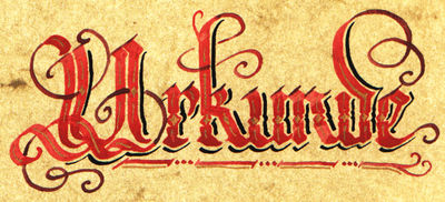
Many typefaces are based on historical hands, such as Blackletter (including Fraktur), Lombardic, Uncial, Italic, and Roundhand.
Calligraphy today
Calligraphy today finds increasingly diverse applications. These include graphic design, logo design, type design, paintings, scholarship, maps, menus, greeting cards, invitations, legal documents, diplomas, cut stone inscriptions, memorial documents, props and moving images for film and television, business cards, and handmade presentations. Many calligraphers make their livelihood in the addressing of envelopes and invitations for public and private events including wedding stationery. Entry points exist for both children and adults via classes and instruction books.
The scope of the calligraphic art is more than pure antiquarian interest (Zapf 2007; Mediavilla 1996; Child 1988, 1976 & 1963; International Typeface Corporation 1982). Johnston's legacy remains pivotal to the ambitions of perhaps most Western calligraphers-
"It is possible even now to go back to the child's- something like the early calligrapher's- point of view, and this is the only healthy one for any fine beginning: to this nothing can be added; all Rules must give way to Truth and Freedom" (Johnston 1909: contents page).
Written forms can be abstracted and are incorporated into works which have as much affinity to contemporary painting as to ancient manuscript writing. The abstract writing of artists such as New Zealander Colin McCahon would not be accepted as "calligraphy" by most practitioners, however engaging one finds such work and its Biblical content in the second half of the twentieth century (contrary to Bloem and Browne's use of the term for McCahon's work for example (2002: 25)) (Gray 1986). The difference lies in the lack of a classical education in lettering by the artist, in this example Colin McCahon, which is demonstrated in his work.
At the same time, the multi-million dollar Saint John's Bible project for the 21st century has engaged Donald Jackson with an international scriptorium and is nearing completion. It is designed as a 21st century artefact, the most substantial illuminated Bible in 500 years executed with both ancient and modern tools and techniques. The earlier 20th-century "Bulley Bible" was not commissioned, though executed by a student of Edward Johnston's (Green 2003). An international short list of notable calligraphers who have led the calligraphic art into the new century includes Donald Jackson, Hermann Zapf, Thomas Ingmire, Dave Wood, Hazel Dolby, Jean Larcher, Julian Waters, Sheila Waters, Denis Brown, Brody Neuenschwander, Hans-Joachim Burgert, Timothy Donaldson, Gottfried Pott, Paul Shaw, Peter Gilderdale and Katharina Pieper.
The digital era has facilitated the creation and dissemination of new and historically styled fonts; thousands are now in use. It is notable that German calligrapher and type designer, Hermann Zapf, is the Honourary President of the Edward Johnston Foundation. Calligraphy gives unique expression to every individual letterform within a design layout which is not the strength of typeface technologies no matter their sophistication (Zapf 2007: 76-7; Thomson 2004 versus Prestianni 2001). The usefulness of the digital medium to the calligrapher is not likely to be limited to the computer layout of the new Saint John's Bible prior to working by hand however (Calderhead 2005). Writing directly into the digital medium is now facilitated via graphics tablets (e.g Wacom and Toshiba) and would be expected to grow in use with the introduction of Microsoft Windows Vista operating system ("Vista Pen Flicks") in 2007. Apple Inc. introduced similar "shorthand" facility in their Tiger operating system in 2005, the new Leopard operating system is due now in mid 2007. Graphics tablets facilitate calligraphic design work more than large size art pieces (Thomson 2004). The internet supports a number of online communities of calligraphers and hand lettering artists.
Tools
The principal tools for a calligrapher are the pen, which may be flat- or round-nibbed and the brush (Reaves & Schulte 2006; Child 1985; Lamb 1956). For some decorative purposes, multi-nibbed pens — steel brushes — can be used. However, works have also been made with felt-tip and ballpoint pens, although these works do not employ angled lines. Ink for writing is usually water-based and much less viscous than the oil based inks used in printing. High quality paper, which has good consistency of porousness, will enable cleaner lines, although parchment or vellum is often used, as a knife can be used to erase work on them and a light box is not needed to allow lines to pass through it. In addition, light boxes and templates are often used in order to achieve straight lines without pencil markings detracting from the work. Lined paper, either for a light box or direct use, is most often lined every quarter or half inch, although inch spaces are occasionally used, such as with litterea unciales (hence the name), and college ruled paper acts as a guideline often as well.
Islamic calligraphy
- Calligraphy Islamic - Islamic Calligraphy Online
- Gallery of Arabic calligraphy - National Institute for Technology and Liberal Education
- Samples of Islamic calligraphy
- Islamic Calligraphies in the Library of Congress, Washington D.C.
- Islamic Calligraphy Articles and examples of Islamic-Turkish Calligraphy (in Turkish). (Click "Galeri" graphic gallery.)
- Custom Arabic Calligraphy
